
NEWS CONCIERGE
CONFIRMATION OF DEATH
WHAT IS
CONFIRMATION
OF DEATH?
To place a death notice in the paper, News Concierge would require confirmation that the deceased has indeed passed. This verification is necessary to prevent malicious activities such as false death notices or threats.
To confirm the passing, our Customer Service team would manually verify the information by contacting either the customer or the listed funeral director. Unfortunately, this process is time-consuming and would often take several hours each week to complete.

THE
PROJECT
My Role: Lead UX/ UI designer, product design, user research, project coordinator and product tester.
Business Goal: The Customer Service team needed to reduce their cost to serve by shortening call times and focusing on other business priorities.
Customers Needs: It was important to ensure that customers placing a genuine death notice for a loved one do not feel scrutinised during the process. Another key consideration was Funeral Directors, who assist with verification not out of obligation, but out of goodwill. Therefore, any new process introduced needed to take the same amount of time or less to confirm the death, in order to respect their time and maintain their willingness to help.
Hypothesis: By embedding the death verification process into the online booking journey—by enabling a seamless interaction between the customer placing the notice and the funeral director confirming the details—then we can reduce the need for manual calls by the Customer Service team, provide a smoother experience for grieving users, and make it easier for funeral directors to support the process efficiently.
RESEARCH AND PERSONAS
Based on prior research, we identified two key user groups affected by this enhancement: private individuals and funeral directors. It was essential to ensure the design solutions provided value and usability for both. To support this, we developed detailed personas to better understand each group's goals, preferences, and pain points, helping guide empathetic and user-centred design decisions.
I created personas to help identify key considerations in the design process. For funeral directors, it was important that any solution we implemented was time-efficient, easy to use, and sensitive to the needs of grieving customers. The experience needed to be respectful and non-intrusive, while still supporting their workflow.

.jpg)
USER JOURNEY
Together with the Product Manager, Customer Service Team Leader, and members of the development team, we collaborated to create the user journey. We mapped out the key information required from private party customers, how that information would be communicated to funeral directors, and how our Customer Service team would be notified. Once the user journey was defined, I began translating it into design concepts.

Simplified version of User Journey
USABILITY
STUDY
FINDINGS
I conducted a usability study with several funeral directors to evaluate the effectiveness and usability of the new dashboard. The goal was to understand whether they found the interactive prototype intuitive and if they preferred it over the previous process of receiving a phone call.
Questions and KPIs of the usability test.
Research questions
-
How long does it take each user to navigate each design?
-
Can the user successfully confirm a Death Notice?
-
Can the user successfully deny a Death notice?
-
Can we identify any additional pain points that were not previously considered?
Key Performance Indicators
-
Time on Task: How long does it take the user to complete.
-
Conversion Rate: How successful they are to complete the task.
-
System Usability Scale: Questionnaire for usability.
-
User error rate: Indicate the parts of a design that cause users to make errors.
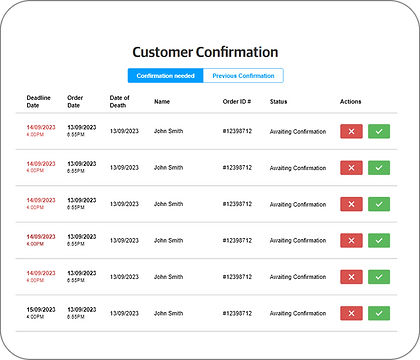
My initial concept included simple 'Approve' and 'Cancel' buttons, but after user testing, it became clear the workflow was more complex. Funeral directors required the ability to select from multiple reasons when disapproving a notice and to update the status of a notice as needed. I redesigned this section to accommodate those needs.
FUNERAL DIRECTOR DETAILS
The dashboard design for funeral directors went through several iterations before the final version was approved. It needed to align with the existing dashboard layout used by all users when placing an ad, ensuring consistency across the platform.
INITIAL DESIGN
FINAL DESIGN

ENTERING FUNERAL DIRECTORS DETAILS
The original user journey presented a significant pain point. Users who didn’t know the funeral director’s details or the coroner case number were instructed to type 'NOT AVAILABLE'—a confusing and unintuitive solution that led many to abandon the process. Addressing this issue was critical in the redesign. Instead of relying on free-text input, we introduced a multiple-choice approach, allowing users to select from three clear options: 'Funeral Director', 'Coroner’s Office', or 'Not Available'. This transformed a vague task into a guided decision, reducing confusion and friction.
Additionally, we implemented an autocomplete feature for the funeral home field, making it easier for users to find and select the correct funeral home—especially useful for franchise businesses operating across multiple states.
ORIGINAL USER JOURNEY

NEW USER JOURNEY


FINAL OUTCOME
After launching the Confirmation of Death project, I monitored user interactions with the funeral director input section to evaluate its effectiveness. Over the following months, we observed a measurable reduction in customer service call time related to death notice confirmations. Additionally, the redesigned input experience led to a 20% decrease in user error alerts, indicating improved clarity and usability for funeral directors.

-50%
Reduction in customer service call time for death notice confirmations.

-20%
Decrease in user error alerts when users are on the 'Content Capture' page.