
ITALIAN RESTAURANT
DELIVERY FUNCTIONALITY
Italiana is an Italian restaurant located in the outer city suburbs of the CBD. Italiana offers a wide range of traditional Italian cuisine that can be delivered straight to the customers door. Italiana targets customers that want gourmet traditional high quality food without having to do the work or leave the house.

THE GOAL
Specific difficulties for the user when they order food by delivery. Users are able to achieve additional tasks, customising their items and selecting their location, while in journey. The goal was to design a food delivery user journey for the Italiana app. The journey is concise, consistent and is easy to use.
MY ROLE
UX designer leading the app and responsive website design from conception to delivery. Conducting interviews, paper and digital wireframing, low and high-fidelity prototyping, conducting usability studies, accounting for accessibility, and iterating on designs.

USER RESEARCH
I conducted interviews and created empathy maps to understand the users I’m designing for and their needs. The goal was to see if there are any specific difficulties for the user when they order food via a delivery. To know whether users can complete this main task and see if they are able to achieve additional tasks, customising their items and selecting their location. This user group confirmed initial assumptions.
PERSONAS
PERSONA 1
.jpg)
Joe is a busy worker who is moderately tech savvy. He wants a streamline and easy process when ordering for a delivery.
PERSONA 2
.jpg)
Sophie is a person that wants to ensure that the food she orders is still warm and not soggy. She wants to know how long it will take for her food to be delivered.
IDEATION
Illustrations of the app on paper ensured that the elements that made it to digital wireframes would be well-suited to address user pain points. I made location the first step in the delivery journey to allow users to know instantly how long their food will take to get to them.

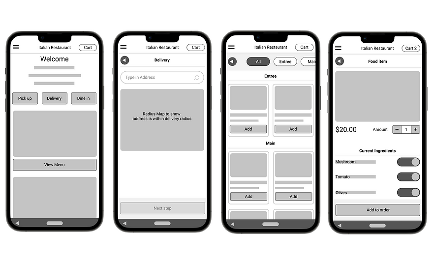
DIGITAL WIREFRAMES
As the initial design phase continued, I wanted to ensure that I was factoring in the users pain points to create the optimal user journey. I wanted the the user journey to be informative as possible without making the journey slow and laborious.
USABILITY STUDY FINDINGS
I conducted two rounds of usability studies. Findings from the first study helped guide the designs from wireframes to mockups. The second study used a high-fidelity prototype and revealed what aspects of the mockups needed refining.
ROUND 1
-
Button that is more prominent and is not hidden below the fold.
-
Information in regards to their food delivery early within the user journey.
-
Information in regards to adding and removing ingredients from their food.
ROUND 2
-
Save Details for next time.
-
Payment Summary before payment.
-
Allowing for ‘Extra’ ingredients different from additional.
HIGH-FIDELITY PROTOTYPE
The second usability study revealed multiple areas of improvement, one of these areas being is an opportunity for the user to save their details for next time by creating a profile.

CONCLUSION
During this project I learnt that the key to user experience is research and user testing. These things help shape and define your project to be successful.