
NEWS CONCIERGE
AD BUILDER
AD-BUILDER
EXPLAINED
In News Concierge, self-serve customers can create and design their ads or notices based on their individual needs. While this experience is intuitive on desktop due to the larger screen and clearer layout, the mobile experience presents usability challenges. Limited screen space and smaller touch targets make it difficult for users to make precise adjustments, leading to frustration and an increased likelihood of drop-off.

THE
PROJECT
My Role: Lead UX/ UI designer, product design, user research, project coordinator and product tester.
Business Goal: To reduce the drop-off rate among mobile users during the ad editing and design process, while also ensuring the final design complies with technical constraints.
Customers Needs: To ensure that customers editing their booking on a mobile device enjoy a smooth experience, find the interface intuitive, and feel confident in completing their booking successfully.
Hypothesis: By optimising the mobile experience through improved button layout and information architecture in the ad builder, we can create a more streamlined and intuitive process that aligns more closely with the desktop experience.
BACKGROUND AND HISTORY
News Concierge was originally designed for desktop use. However, as our older demographic becomes more tech-savvy, more users are now accessing the platform via mobile devices. One particularly complex component of the booking journey allows users to customise their ads in detail. On mobile, the button layout and modal padding were not visually appealing or user-friendly. Based on FullStory session analysis and customer feedback via the call centre, we discovered that users were often missing key buttons—elements they were accustomed to seeing clearly on desktop.

Using quantitative insights from FullStory and CSAT scores, we identified a significant drop-off point in the mobile ad builder journey. Qualitative feedback from the call centre and CSAT comments revealed that many users struggled to make adjustments and were unsure how to save and proceed. I cross-referenced this feedback with FullStory session recordings, which confirmed the issue. I also discovered that several interface elements, particularly those related to cancelling and saving progress, were poorly positioned and labelled in a way that made the experience confusing and unintuitive.
COMPETITOR RESEARCH
Because the News Concierge Ad Builder had no direct competitors, I looked to adjacent products, particularly mobile-first design tools like Canva and various photo editing apps, for inspiration. A consistent UX pattern across these platforms was the placement of primary editing tools within the thumb-friendly zone at the bottom of the screen, optimising for one-handed use. Meanwhile, secondary actions such as Save, Cancel, Undo, and Share were typically located in the top navigation.


REDESIGNING THE STRUCTURE
The Ad-Builder had four layers of menus. Although logical, this structure was quite deep and made it easy for users to get lost in the sub-menus. My job was to simplify this process, although I was constrained by the existing architecture of the Ad-Builder. Instead of four layers of menus, I redesigned the Ad-Builder to have three layers. Users are now greeted with two initial menus: a master menu for actions such as Save, Close, and Undo, and an add element menu where 'Add textbox' and other elements are located.
ORIGINAL USER FLOW


NEW USER FLOW
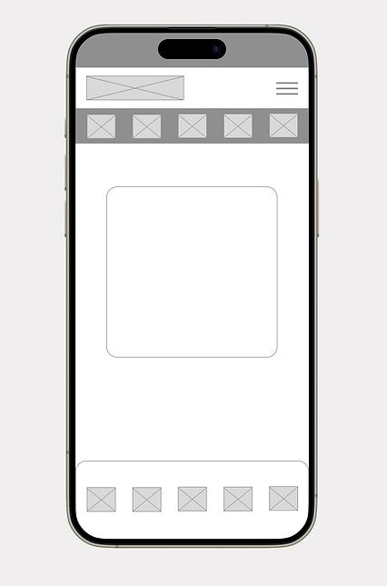
WIREFRAMES
After mapping the user flow, I created wireframes to define the layout, prioritise content, and determine the optimal placement and sequence of interface elements. I then used FullStory to analyse user interactions, identifying which buttons were most frequently used and which could be removed or deprioritised to streamline the experience.
UI ENHANCEMENTS
While building out the UI, I looked for opportunities to enhance usability. I replaced text input fields with sliders for easier thumb interaction, added visual previews for font selection. These changes made the interface more intuitive, reducing cognitive load and improving the overall editing experience.


FINAL DESIGN
The design went through several iterations before a final version was approved. This design featured three layers of menus, and some buttons were redesigned to become sliders. The new design also relocated the Chat-bot to the header to free up space. Using Fullstory, we analysed which actions were the most popular and reordered them accordingly.

FINAL OUTCOME
After launching the Ad Builder, we monitored user interactions using analytic tools to evaluate the design’s effectiveness and uncover areas for improvement. The data revealed a 4% increase in booking completions and a 7% increase in the average cart value per customer.
+4%
Increase in booking completions on mobile and tablet devices
+7%
Increase in the average cart value per customer.