
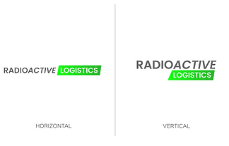
RADIOACTIVE LOGISTICS
The startup company Radioactive Logistics was logo to reflect its brand. Radioactive Logistics brief was that they wanted to convey their professional services with a clear and crisp design with the inclusion of green to symbolise 'clean energy' and the symbolism of green that is often connected with 'Radioactive'.
INITIAL BRIEF
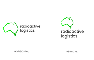
The client did an initial draft for what they wanted which included an icon of Australia to symbolise the service location.

IDEATION
I began with the exploration phase and created multiple variations that explored in different styles of Australia as an icon but also exploring different icons that can be used with the phrase 'radioactive' so I started looking at using icons of atoms.


FINAL DESIGN & COLOUR EXPLORATION
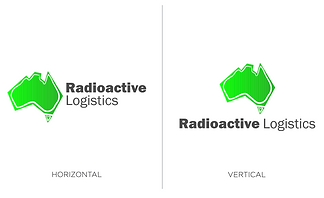
Once the final designs were shown to the client, they ended up liking a combination of two logos. In the next step, I merged the two designs and explored various colour options to see how they fit with the new design. I also refined the font to perfect the design.
